ASUCD Logo Library
Logo

When looking at the association as a whole, we saw how each unit reaches a different student population or part of campus. Our units are able to connect students with other students as well as to the activities they enjoy. That’s when it all fits together. The circle, already known to represent wholeness and community, was the perfect shape to convey the most important message of ASUCD: oneness. We extended this across our identity—each unit and individual’s contribution to the association is represented by a dot.
The ASUCD logo consists of five dots over the ASUCD wordmark. The four circles on the right side of the logo represent the four pillars of ASUCD, which encompasses all of our units and programs. These four pillars merge into a single circle on the left side of the logo, representing the set of values we all operate under and strive to live out.
These five dots express how ASUCD is made up of the sum of its parts, each dot is equally important. ASUCD thrives based on everyone’s contribution and cannot function properly if even one pillar is not aligned, or in harmony, with the rest.
Note: The ASUCD logo represents the entire community as a whole and, therefore, is a critical brand asset. It is vital that the logo stays consistent to display unity between all ASUCD units.
Logo Usage
Colors
When representing ASUCD as a whole, use the logo in gold, white, or black. When representing one of the four pillars of ASUCD, it is acceptable to use that respective color.
Placement
When creating a composition, please put the ASUCD logo in one of the corner areas of the design or in the center of the page. This does not apply when using the dot logo as a pattern or graphic element.
Proportions
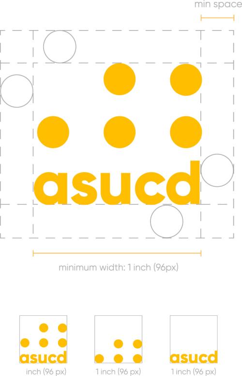
The minimum width of the logo is 0.75-inches. Any dimension
smaller than that will negatively impact its readability.
Inappropriate Logo Usage

Do not intrude on negative white space. | 
Do not add new parts to the logo. |

Do not rearrange the elements of the logo. | 
Do not use colors outside of our identity system. |

Do not use gradients. | 
Do not rotate the logo. |

Do not change the typography. | 
Do not stretch or condense the logo. |

Do not use the logo on backgrounds with inadequate contrast. | 
Do not attempt to recreate the logo. |
Logo Usage
Visual Identity Architecture
ASUCD’s visual identity architecture is applied across all units and programs, providing flexibility for each brand operating under the organization. Based on our core goal of “oneness,” we designed each unit with its own circle icon logo. Every logo is custom designed but still maintains continuity through the system as a whole because of the consistent silhouette.

Unit Logos & Signatures
We implemented the circles across our brand by creating circular icon logos for each unit. All units have their own logo and each sector of student government has its own logo. All commissions, committees, and senators use the respective logo of the sector they belong to and do not have their own custom icon. This brings consistency to the brand as a whole and makes it easier to see where each commission and committee belongs in the larger organization of our student government.
Unit Logos

Alternative Unit Logos

Student Government & Commission Logos
Committee Logos
